Key Takeaways
- Google uses mobile-first indexing, your mobile site is the primary version Google crawls and ranks.
- Over 60% of all Google searches happen on mobile devices, making mobile optimization non-negotiable.
- Core Web Vitals (LCP, INP, CLS) are measured on mobile and directly impact your search rankings.
- Responsive design is Google's recommended approach, one URL serving all devices with CSS media queries.
Mobile-First Indexing
Since March 2021, Google uses mobile-first indexing for all websites. This means Googlebot primarily crawls and indexes the mobile version of your site. If your mobile page is missing content, structured data, images, or internal links that exist on your desktop version, Google will not see or consider that content for ranking. This is a fundamental shift, your mobile site is now your primary site in Google's eyes. For background context, see the reference at Google Search Central documentation.
To check if mobile-first indexing is working correctly for your site, open Google Search Console and use the URL Inspection tool. It shows you exactly what Googlebot sees when it crawls your mobile page. Compare the rendered HTML against your desktop version to identify any missing elements. Common issues include hidden content behind "read more" toggles (Google does index this content, but ensure it loads without user interaction), lazy-loaded images that fail to load for the crawler, and navigation menus that are inaccessible in the mobile version.

- Ensure the same content, meta tags, and structured data appear on both mobile and desktop versions
- Use the Mobile-Friendly Test tool at search.google.com/test/mobile-friendly to check individual pages
- Avoid separate mobile URLs (m.example.com), responsive design on a single URL is the recommended approach
Pro Tip: Use Chrome DevTools (F12 > Toggle device toolbar) to simulate mobile views and test your site on different screen sizes. Check that all content loads correctly, buttons are tappable, and text is readable without zooming.
Responsive Design
Responsive design uses CSS media queries to adapt your website's layout to different screen sizes and orientations. Google recommends responsive design over separate mobile sites (m.domain.com) or dynamic serving because it uses a single URL, making it easier for Google to crawl and index while consolidating all link equity to one URL. Most modern frameworks and CMS platforms (WordPress, Shopify, Next.js) support responsive design out of the box.
Key responsive design best practices for SEO include: set the viewport meta tag (<meta name="viewport" content="width=device-width, initial-scale=1">), use relative units (%, rem, vw) instead of fixed pixel widths, ensure touch targets are at least 48x48 pixels with adequate spacing, and make fonts at least 16px for body text to prevent Google from flagging readability issues. Test across real devices, emulators do not always catch rendering issues that occur on actual phones.
- Avoid horizontal scrolling, content should fit within the viewport at all breakpoints
- Use CSS flexbox or grid for layouts instead of tables or fixed-width containers
- Serve appropriately sized images using srcset to avoid downloading oversized desktop images on mobile
Mobile Page Speed
Mobile users typically connect via 4G or 5G networks, but speeds vary dramatically by location. Google research shows 53% of mobile users abandon a page that takes longer than 3 seconds to load. To diagnose mobile speed issues, run your pages through Google's PageSpeed Insights (pagespeed.web.dev), which provides both lab data and real-user field data (CrUX). Focus on the field data, it reflects actual user experience.
The biggest mobile speed wins usually come from image optimization (converting to WebP/AVIF, compressing, and lazy loading), eliminating render-blocking CSS and JavaScript, enabling browser caching, and using a CDN. For WordPress sites, plugins like WP Rocket or Autoptimize handle most of these optimizations. For custom-built sites, implement code splitting, tree shaking, and preloading critical resources.
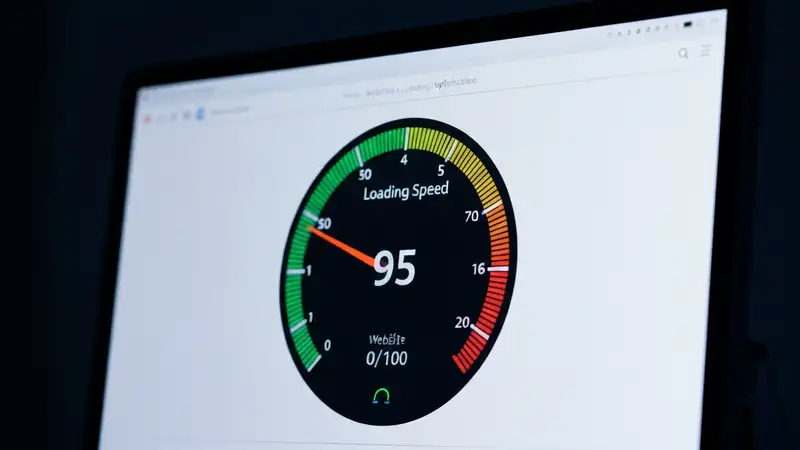
- Target LCP (Largest Contentful Paint) under 2.5 seconds, this measures when the main content is visible
- Minimize third-party scripts (analytics, ads, chat widgets), each one adds network requests and parsing time
- Use Rank Crown's site audit to identify speed issues across your entire site, not just individual pages
Pro Tip: Throttle your network connection in Chrome DevTools (Network tab > Throttle > Slow 3G) to experience your site as slower mobile users do. This reveals issues that are invisible on fast connections.
Core Web Vitals
Core Web Vitals are Google's three specific metrics that measure real-user page experience: LCP (Largest Contentful Paint) measures loading speed, your main content should load within 2.5 seconds. INP (Interaction to Next Paint) measures interactivity, the page should respond to user input within 200 milliseconds. CLS (Cumulative Layout Shift) measures visual stability, elements should not shift around as the page loads (score below 0.1 is good).
Google uses field data from the Chrome User Experience Report (CrUX) to evaluate Core Web Vitals for ranking purposes. Check your scores in Google Search Console under the "Core Web Vitals" report, which shows which pages pass or fail each metric. Common fixes for LCP include preloading hero images and fonts. For INP, reduce JavaScript execution time and break up long tasks. For CLS, always set explicit width and height attributes on images and embeds to reserve space before they load.
- Use the Web Vitals Chrome extension for real-time CWV measurement as you browse your site
- Prioritize pages with the most organic traffic, fixing CWV on high-traffic pages has the biggest ranking impact
Mobile UX
Mobile UX directly impacts SEO through engagement metrics like bounce rate, time on page, and pogo-sticking (users quickly returning to search results). Google measures these behavioral signals to assess whether your page satisfies the search query. A mobile page with small tap targets, intrusive interstitials (popups), or unreadable text will drive users away, sending negative signals to Google.
Ensure tap targets (buttons, links) are at least 48x48 pixels with 8px spacing between them. Avoid intrusive interstitials that cover the main content, Google penalizes pages with popups that appear before users can engage with content (except for legally required notices like cookie consent). Use legible font sizes (minimum 16px for body text), sufficient color contrast, and clear visual hierarchy. Sticky headers and navigation bars should be compact to avoid consuming valuable screen real estate.

- Use thumb-friendly navigation, place primary actions within easy reach of one-handed use
- Implement a visible, accessible search function for content-heavy mobile sites
- Test your site on real mobile devices, not just browser emulators, actual device testing reveals touch and scroll issues
Pro Tip: Check Google's Mobile Usability report in Search Console, it flags specific pages with issues like "Clickable elements too close together" or "Content wider than screen." Fix these to eliminate mobile UX penalties.
Mobile & Local SEO
Mobile search and local search are deeply connected, "near me" searches have grown over 500% in recent years, and nearly all of them happen on mobile devices. Google uses the searcher's location to serve local results, making mobile optimization critical for any business with a physical presence. Ensure your Google Business Profile is complete and accurate, your NAP (Name, Address, Phone) is consistent across all directories, and your site includes location-specific content.
For local mobile SEO, implement LocalBusiness schema markup to help Google understand your business details, embed a Google Map on your contact page, and create location-specific landing pages if you serve multiple areas. Mobile users performing local searches typically convert within hours, which is why proximity, click-to-call wiring, and Map Pack eligibility outweigh classic ranking signals at the moment of the query. Make sure your phone number is click-to-call enabled and your address links to Google Maps.
- Add click-to-call buttons and click-to-directions links prominently on mobile layouts
- Optimize your Google Business Profile with photos, hours, services, and encourage customer reviews
Frequently Asked Questions
What is the main focus of Mobile SEO?
Mobile SEO focuses on optimizing your website for mobile-first indexing, responsive design, page speed on mobile devices, Core Web Vitals performance, mobile user experience, and the intersection of mobile and local search. Since Google indexes the mobile version of your site first, these optimizations directly determine your search rankings across all devices.
How long does it take to see results?
Mobile speed improvements like image compression and render-blocking resource fixes can show results within 2-4 weeks as Google re-crawls. Core Web Vitals improvements typically take 28 days to reflect in CrUX data since Google aggregates a rolling 28-day window of field measurements.
Do I need a separate mobile site?
No. Google recommends responsive design (one URL for all devices) rather than separate mobile URLs (m.domain.com). Responsive design consolidates link equity, simplifies crawling, and avoids duplicate content issues. If you currently have a separate mobile site, plan a migration to responsive design.
Is AMP still relevant for mobile SEO?
AMP (Accelerated Mobile Pages) is no longer required for Google's Top Stories carousel or other search features. Google removed the AMP requirement in 2021. Focus on meeting Core Web Vitals thresholds with your standard mobile pages instead of maintaining a separate AMP version.
Related Resources
SEO Tool Comparison at a Glance
Choosing the right toolkit depends on your budget and the part of SEO you optimize most often. The table below summarizes how Rank Crown compares to the main alternatives covered across our resources.
| Tool | Starting Price | Free Plan | Best For |
|---|---|---|---|
| Rank Crown | $39/mo | Yes | Focused rank tracking + audits without bloat |
| Ahrefs | $129/mo | Limited | Backlink intelligence and large databases |
| Semrush | $139.95/mo | Limited | All-in-one for agencies combining SEO and PPC |
| Moz Pro | $99/mo | Limited | Beginner-friendly metrics like Domain Authority |
| SE Ranking | $65/mo | No | Budget-friendly tracking with white-label reports |
| Mangools | $29.90/mo | No | Lean keyword research workflow |
Prices verified 2026-05-20 from each vendor's public pricing page. Annual billing typically discounts these figures further.
Ready to Improve Your SEO?
Try Rank Crown's SEO tools to analyze, track, and optimize your website's search performance.
Start Free Trial